


|
Nation Character Profiles |


|
Project Nation |
|
|
|
|
|
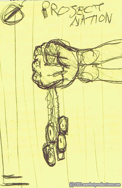 |
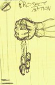
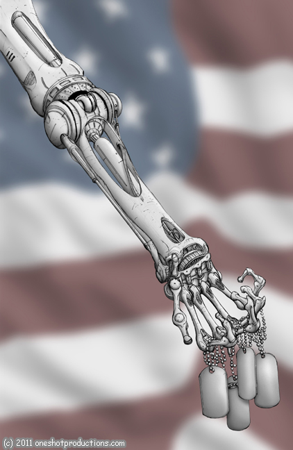
The first step is coming up with the concept. I thought a skeletal arm holding military dog tags would be relevant to the content of the book without giving away any of the plot. As a reader, this cover would make me think "hey, I want to know what is going on in that comic." I sketched this concept design on a sticky note and emailed it to the book's artist, Curtis Rhodes. I thought I'd create a digital background of red & white stripes, but wasn't certain. |
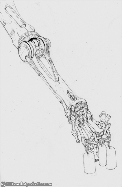 |
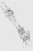
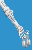
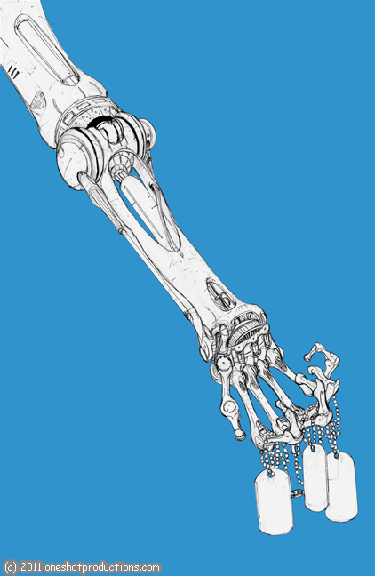
After a conversation with Curtis before he started drawing, he asked about the position / direction of the arm. His decision to position the arm diagonally was so much better than my static horizontal sketch. This is his art as I recieved it, without and digital work done yet. |
 |
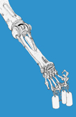
Once I have Curtis' art, I began separting the image into layers. At this early point, there are two main layers: the foreground (robotic arm & dog tags) and the background (the rest of the page). I made this simple bright blue background underneath Curtis' art, then carefully cut away all the parts of the page that aren't part of the foreground elements. As I do this, the bright blue shows through, so I know what has been cut away and what hasn't. |
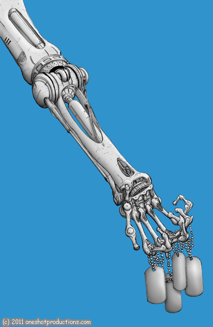 |
In this step, you'll notice that there's an extra dog tag. Since the hero robot has the memory of four different people, I thought it may be confusing to have only three dog tags on the cover. I copied the rightmost tag, squished it a bit so it wouldn't be identical, then placed it behind the others. At this stage, I began shading the arm, hand, and tags. this is probably took the longest of all the steps. |
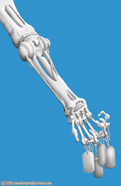 |
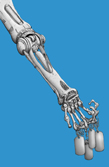
Here's what the shading looks like without any of the artwork. This view reveals all the digital brush work I did, adding shading to Curtis' line work. I like the 3D look of this version, and briefly considered using this version on the cover. Ultimately, it made more sense to use Curtis' artwork with it, as it's closer to the art inside the book. |
 |
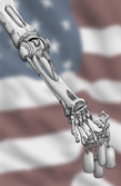
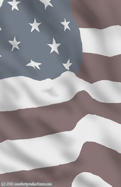
With the shading and everything else done on the foreground layer, I turned my attention to the background. I still didn't have a clear picture in my head of what the background would look like, so I made a mock cover using a US flag photo from the internet. The next day, I opened the cover file again, and felt that the mock up cover nailed the appropriate look for the background. So, I created a new layer and hand drew the lines to mimic those of the internet photo, making some alterations along the way. In the original photo, the flag folded over on itself too much in the upper right hand area, so I just didn't do that with my flag. The colors here are the same ones I used on the main character in the book. |
 |
Using a photoediting technique I learned in an online tutorial, I created a "fabric layer" to use with the flag. Once again, I used the photo as a guideline, and altered the shadows in some places. During this step, I kept the arm layer visible, so I could see how the shadows were working with the page overall. As a result, you can see a wide blank area moving diagonally in the same fashion as the arm. Also, with the arm in the way, I didn't realize I made that weird little divot near the center of the page. |
 |
This is what the color layer and fabric layer look like together. That fabric makes all the difference! Look at the difference between the stars and stripes alone, and then with this fabric layer added. |
 |
I added a generous amount of blur to the background, because I wanted the foreground to really stand out here. The arm is so detailed and intricate, I wanted the opposite for the background image. I adjusted the blur amount carefully though, and was really pleased with how it turned out. However, the background was still just a bit too dull and had about the same tone as the robot arm. To remedy this, I increased the amount of color "saturation," basically making the colors more vibrant or intense. |
 |
Here's a "clean" cover, before adding the title, credits, and logo. At this point, all the foreground and background elements are finished. |
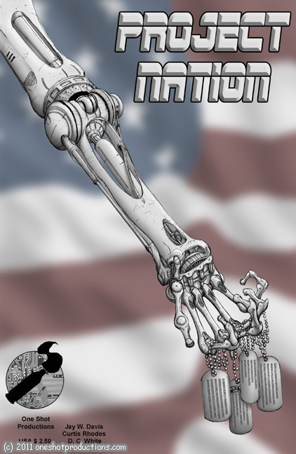 |
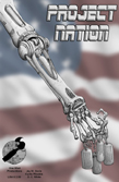
The last thing to do on this page was adding all the text and logos. I designed the "Project Nation" title lettering months ago, but it contained a lot of red, white & blue inside the letters. It was more or less camoflauged against the wavy flag background. I decided to go instead with a metallic version of the title lettering, and use an "embossing" technique to get that slightly 3D look. I altered my normal black & purple One Shot cartridge logo to contain the circuit texture. I slapped the creative team's names, company name, and price in the lower corner. With that, the cover was completely assembled. |